Two themes, two sets
Dark components use the Formula-Style mode. Light/ components are separate sets with the same structure. Light screens only use Light/ components.
One library for every Predix screen. Each component ships in the dark Formula-Style theme and a separate Light set with the same structure.
Principles
Dark components use the Formula-Style mode. Light/ components are separate sets with the same structure. Light screens only use Light/ components.
Icons/Currency and Share/Image Card are shared by both themes. Logos, avatars and coin icons are content and never change colour by theme.
Components match the Final Dark and Final Light screens. Gradients are only allowed on the dark Betslip bet button. The mode switcher shows on mobile only.
Real Predix components. They animate on their own; switch to Try it to play with them.
Navigation/Bottom Nav BarBetslip/Bet ButtonState = Default
Notification/ItemData/Probability BarData/Probability RingNavigation/TabNavigation/Mode Switcher/MobilePrediction
Event/Hashtag ChipState = Default
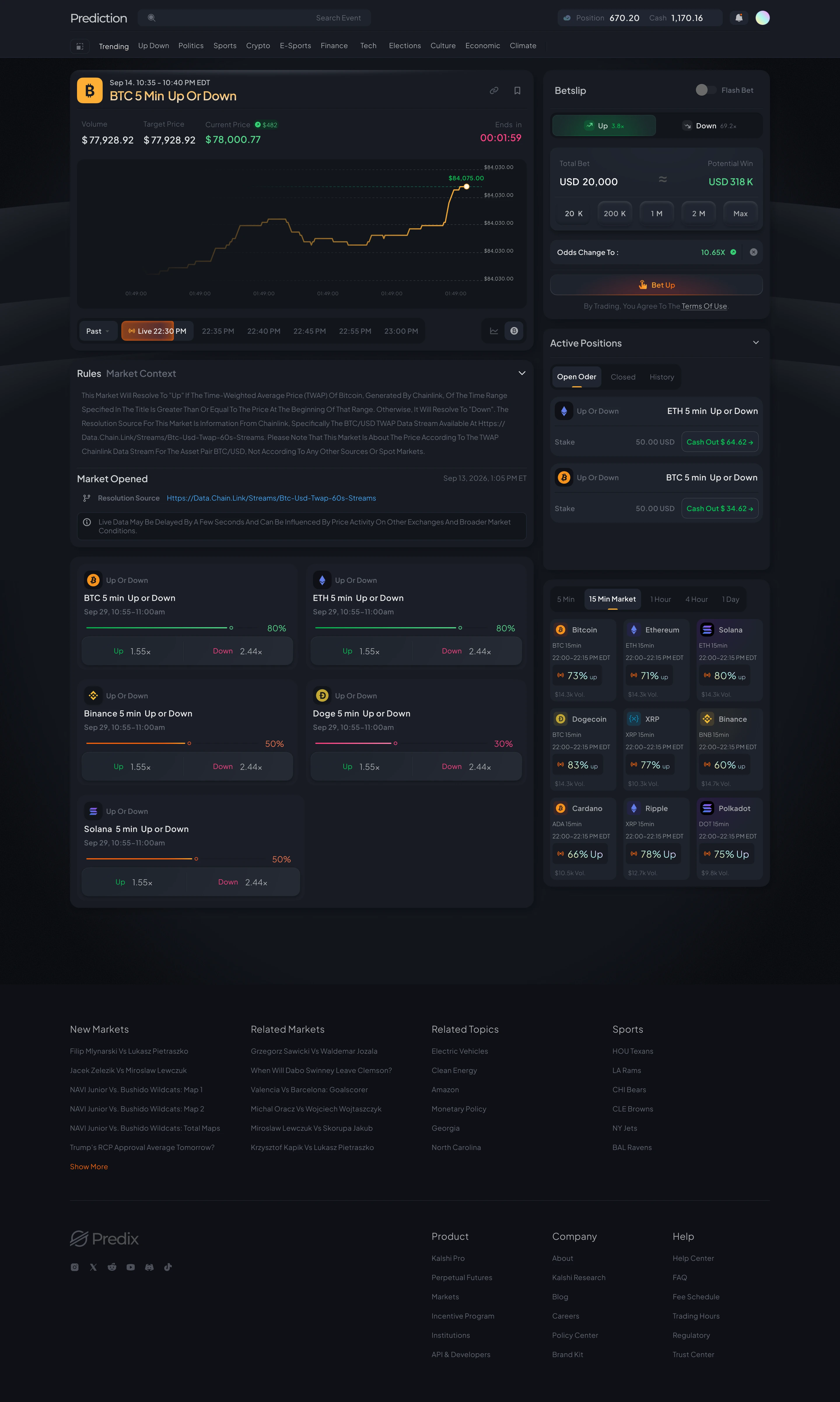
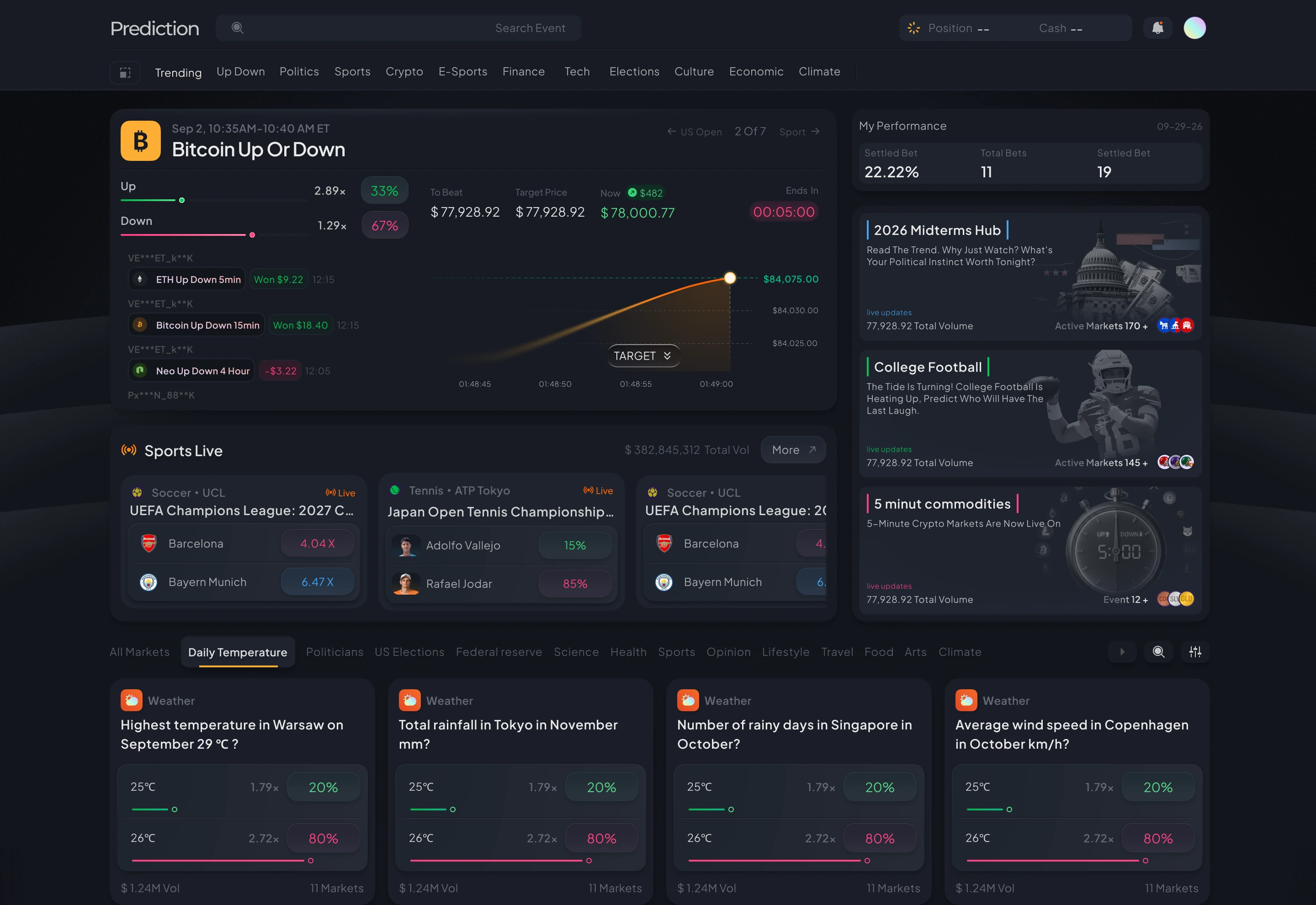
Navigation/Market PaginationThe real Predix Final screens, linked into one flow: Home, event overview, event detail, then placing a bet.
Every colour in the library is a variable. Open a group, then click a swatch to copy its value.
Spacing and radius variables from the Layout collection.
Click a sample to edit the text.
Visual style proposals from the Predix social campaign: posts, motion and device shots built with the same components.